Twitting... this post!

Friday, October 26, 2012

FALL IN LOVE AGAIN (with your home)


I think I already said in this blog that fall is my favorite season… But here I have to say it again. Every fall I “fall in love again”. I fall in love with the warm colors of the trees, I fall in love with the chill in the air and the cozy sweaters… the hearty food, all kinds of pumpkins decorating peoples' house. For me, the mood of fall has a feeling that mother earth is coming to visit my home. So I have to do something special to wait for her… clean and prepare the house, maybe refresh it. How do we refresh the house? Get inspired. Get a lot of inspiration. Do you know Pinterest? It’s a great website to get inspired. Here you can check "my inspiration boards", so maybe you can start there. But there are millions of inspirations out there. Once you are done with getting all the inspirations my first advice is: put away all the accessories from the room that you want change; and then start accessorizing the room again (maybe with some fall elements). Second: re-arrange the furniture if it is possible. Third, perhaps, buy a new piece of furniture. Last, donate everything that you got tired or that you never like it.

Is that Mother-Earth?!?


OK... Let’s start the work! Shake the dust!


BUT.... First, let's make some yummy soup… while the soup is cooking on the stove go back to Pinterest and search for inspirations. Then, get your stomach happy and your body full of energy.

Pumpkin Chowder - Via Country Living Magazine


Ingredients:
3 tablespoon(s) extra-virgin olive oil 2 leeks, trimmed of tough green tops and chopped 3 large garlic cloves, finely chopped 2 medium bell peppers, chopped 2 1/4pound(s) pumpkin, peeled, seeded, and cut into 1/2- by 1-inch-think pieces 1 1/2teaspoon(s) chopped fresh majoram 1/4 teaspoon(s) crushed red pepper 2 bay leaves 1/4 teaspoon(s) salt 1/4 teaspoon(s) freshly ground black pepper 1 1/4cup(s) frozen corn 6 cup(s) vegetable broth.

Directions:
Heat olive oil in a large pot or Dutch oven over medium heat. Add leeks and cook until very soft, about 5 minutes. Add garlic and cook for about 2 minutes. Stir in green peppers, reduce heat to medium-low, and cook until peppers soften, about 8 more minutes. Add the remaining ingredients and cook until pumpkin is tender, about 30 minutes.


Inspired by the colors of the season...


Some of my choices... I think a new chair would add that final touch to the room...
If you want get more information on these pieces visit my board at Pinterest "Seating I Love".


Ohhhh! I found the "ONE"!
...And please look at the color of this hair! Hum.... this might give me some
ideas for my "color day hair" (which is today)!


If you decide to do your "Fall in Love Again" project, please send me pictures of "Before and After". 
I would love to see them!


Tuesday, October 9, 2012

FINDS IN BRAZIL

In August I went to Brazil to visit my family.  I was supposed to stay there for about a month, but I had to extend my stay… I had some documentation issues to resolve and some health problems in the family that contribute to extent my time there.  I felt anxious in the beginning when I find out that I would have to cancel my fight back home and push my time. I needed to come back to US and take care of my life, work to do, etc.  But when you find out that there was nothing that you could do, except to wait for things to resolve, so then you just have one decision to make...  I decided that I would take advantage of the time and really have a great time with my family, friends and enjoy the city that is blooming and expanding.  So one of my activities there it was to take walks every morning and sometimes in the afternoons, exploring the area where my mom lives, where I was staying.  One day during one of my long walks I found this fantastic space (Deposito Rustico - Moveis e Decoracoes) filled with amazing pieces of furniture and all kinds of decorative objects… things very regional mixed with very international classic pieces.  The space is huge and full of small and big treasures.  You walk around and at every single corner you can find a different kind of object: lucid, or sexy, textured, smooth, strong, or delicate, colorful, woody, urban, or country…  What a fun place to shop!  Ah! Another thing that intrigued me it was the fact that the “deposit” is located in a residential area, kind of in the middle of nowhere. It’s hard to explain, but the huge store/kind of a barn is totally out of place.  For me it was definitely a “find” in the town.  How great is to find places like that while you are waiting for the next airplane!


A really like the mix of materials on the store facade.


They also manufacture your own designs and dimensions.
Here are just a few ideas of what they can do.

Isn't massive and solid this bench? Beautiful...


Love this bench!


Furniture made of bike pieces.


How cute are these ludic objects!


A conceptual Brazilian flag.


Tuesday, July 17, 2012

INTERIOR DESIGN PHOTOGRAPHY


Before I say anything else… Again, I have disappeared from here! I know… I know… too bad! I have to confess that I have been lacking motivation to write anything in my blogs. I am not sure why?! Plus, lately I became really busy with my interior design projects and my related courses, which became a great excuse to not pass by here. Oh! I feel bad! I DO. But, it’s ok, I guess. (I always had the blog as a free place… where I come when I feel like coming… It’s kind of my escape). So, as some of you know I am always on track of something, trying to learn something else, trying to grow my professional knowledge and skills. At this time I took a few classes in interior design photography, at the renowned school of photography International Center of Photography (ICP/NY). My instructor was the talented photographer Elliott Kauffman. Great guy! It was a fun course with fun and talented people from different backgrounds, all trying to learn the techniques of lighting interiors for photography. It’s not easy! It’s not easy to take great photos of interiors. Elliott says in one of his emails to us (his students): When the physical, emotional, intellectual and the technical come together, you know that you have a photograph.

I would like to share some of “my results” that came up from the class. I still have a lot to learn, but I think I am on the right path… What do you think?


Bliss Spa NY/Soho - Design by Anisa Romero Art & Design


Bliss Spa Soho/NY - Design by Anisa Romero Art & Design


Bliss Spa Soho/NY - Design by Anisa Romero Art & Design


Bliss Spa Soho/NY - Design by Anisa Romero Art & Design


Bliss Spa Soho/NY - Design by Anisa Romero Art & Design


Bliss Spa Soho/NY - Design by Anisa Romero Art & Design


Bliss Spa Soho/NY - Design by Anisa Romero Art & Design


A friend's house


A friend's house


A friend's house


A friend's house


A friend's house


A friend's house


My own living room


My own office


My dining room


My own bedroom


I would love to hear opnions and critiques!!


Friday, May 11, 2012

TIPS WHEN HOUSE HUNTING


We had another weekend looking for houses in Connecticut. From all the 8 houses we visited there was one that called my attention. It was not a perfect house, but it has so many nice features that I think I could make that works… The first amazing feature about the house is the fact that it is an antique (circa 1780s) house still in very good shape, and of course, full of charm. It needs a little of love and good decorating skills to make it a perfect retreat weekend home. Mike (my hubby) was not totally convinced about that one was the one... which is pretty normal for him. He might have hard time visualizing what the empty place and in careless condition could turn to be. He might not be able to look at the potential of the raw gems. (Well, I am going to give him a chance because he was able to find ME!)  Anyway, I find out that lot of people have difficulties to see the potential of neglected houses that are for sale. One of the ways that I use to not loose the hope is to be positive, look at the good side of things, and try to find a lot of inspirations.  First, I take lot of pictures of the exiting conditions, and then carefully I study it later. Find inspiration images of decorating spaces and architectural features that you like (that matchs to the style of the house). It is simple to do… but it can be a challenging work because you would find a lot of beautiful ideas and then you would not to know what really works for you and your budget. If you have the patience and time to develop the ideas it’s great and you can have a lot of fun; otherwise it's better to hire a designer who would really help you to "see" and possibily would help you making a decision when shopping for a house.

Here I would like the share with you some pictures that I took of my adorable antique cottage that I saw so much potential. And at the same time I want share some inspiration images that would be very helpful when and if the time comes to polish the gem.

POOR THING! It needs somebody with a hat, garden boots and tools!!!


That's the living room. Little funny layout... for sure.

Below just some living rooms that I love... and I think I could some how create a style similiar to these amazing living rooms to the "funny layout" living room above.  I am not sure how my designs would come up.  I would have to take measurments, draw a the floor plan of the area, and try to understand the space better... and then find the right sizes and right pieces for the area.  The photos below are just inspiration images for what kind of style that I want approach.

Design by Lisa Sherry Interiours


Via House of Fifty Blog


Via House to Home


The image below is part of the kitchen... another kind of award layout...
I would have to really think about it!
I would might considered opening the space a little bit more... breaking one wall that separates the kitchen and dining area right now.

Design by Kelly Hoppen (one of my favorite interior designers)

The dining area is really nice.  I like that is filled with light and I can use the space to put a long dining table.  I love skinny and long dining tables!

I am using this beautiful photo taken by Michael J. Lee to inspire me to design the guest bedroom:
"Sweet and simple"

This is the space downstairs that I would have the guest bedroom.


Let's go upstairs!

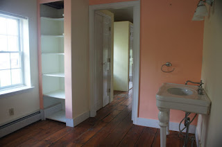
Let me introduce you to the exiting master bathroom:
It's quite big for a cottage house!

Do you see the pontential?!?

Inspiration....
Source Unknown. 

Inspiration...

And here is the general view of the master bedroom.

That's how I visualized it "to be"! I mean, the bed "to be"!
Via Paper Mulberry Blog

And don't forget the sweet details...
For me... "G" for Gross.


The interior has some many weird rooms, when you see for the first time you ask?
"What is the room for?" But then I think... and think... we could explore these areas and create unxepected inviting vingettes like these beautiful ones below.


For the outdoors I would like to add some bright color.
Some really purple blue! And for materials: some metal, some wood, some cotton.
And that blues would complement the blowing of the summer lavender flowers that I would plant all around the short stone wall.

THE END.


IF YOU LIKE THIS POST... SHARE IT! THANKS!

Share |

ATTENTION: POST A COMMENT

Your comments are very important for me! They inspire me to keep going... If you get a RED message: "Your request could not be processed. Please try again." Just hit the POST COMMENT button again. Thanks!


Related Posts Plugin for WordPress, Blogger...